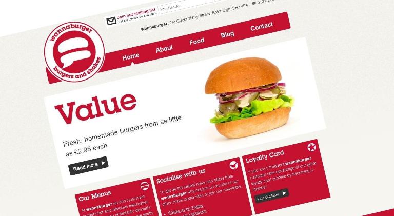
Crush are pleased to announce the launch of the new Wannaburger website, in keeping with their restaurant refurbishment and company re-branding earlier this year.
When Wannaburger first contacted Crush, we jumped for joy. We’re huge fans of their fresh, locally sourced burgers – not to mention the decadent milkshakes – and couldn’t wait to get our hands on their site.
The site re-design forms just part of Wannaburger’s renovation – if you’ve visited them recently you’ll have noticed the restaurant’s refurbishment, complete with easy access order counter and new (comfier) seating. Their branding also underwent a re-design; it’s now sleeker, edgier, and stands out amongst the crowd of other fast food brands out there.
 We designed the website to mirror these adjustments; the new site is slicker to look at and visually less complex than the old site. Five key tabs on the navigation direct the user around the reduced – but more efficient – site and we’ve introduced an upgraded blog that gives Wannaburger the ability to communicate more effectively with their customers online.
The distinctive brand colours are consistently used throughout the site, helping to reinforce the new image. We’ve taken the same approach with Wannaburger’s email marketing, creating an email template, which is snappy, to the point and clearly leads the recipient back to the site.
For those of you who weren’t aware, Wannaburger has two sister pubs; the Caley Sample Room out in Gorgie and the Cambridge Bar on George Street. The websites for these two pubs were looking a little tired so we’re also giving them a fresh breath of life too. We’ll be updating our blog as soon as they go live, but in the mean time, you can visit the new Wannaburger site here.


