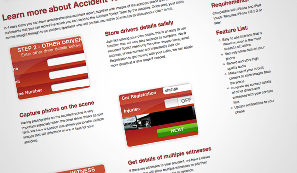
The Accident Toolkit brochure site is now live. The website is the first iPhone App site Crush has built and it’s fair to say we’re quite proud of it. A simple, two page site, it’s clean and minimal, providing internet users with all the information they need in a punchy, visual style.
We built a traditional slider module for the site, but given it a bit of a twist. Instead of the usual rectangular banner, we’ve built the slider module into a mock iPhone, which lets you see what the app would look like on your phone before you buy it.

With snapshots of the different stages of the app, it’s a pretty comprehensive guide to the tool, which is designed to help those in road accidents capture details, audio and images from the accident without the usual kerfuffle for a pen and paper.
The app is perfect for everyone from first time drivers to seasoned motorists; it’s already been snapped up by taxi companies and haulage companies who are keen to protect their drivers.
Best of all, the app is free – and we’ve created a massive green button highlighting this – so there really is no excuse not to buy it.
Currently the app is only available for iPhones but Accident Toolkit are working on apps for Andriods and other smart phones, so look out for updates in the near future. If you’ve got an iPhone and are interested in buying the app for free, have a look at the website: Accident Toolkit.


