In the first of a series of posts we explain to you how Crush takes on a project and evolves it into a finished masterpiece. This week we start with the initial stage in the creative process – design – and how we turn your ideas into a functional user experience.
So this week, we’re looking at Design. Not everyone who comes to us needs us to design a website – sometimes they require a digital marketing strategy or email campaign. But for those that do, we make sure we present them with a fantastic site that blows their mind.
After our account managers chat with the clients, we pass a specification (spec) on to our designers. They’ll look at it with the developers and then the spec will get broken down into design and development (more of which next week).
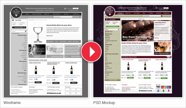
Once the spec has gone into design, the team will create a set of wireframes, which are – usually – black and white templates of what the creative genii’s think the new site should look like. They’ll consider design aspects like calls to action, navigation, colour themes, and the general tone of the site, to create three or four of these wireframes, which the account managers can then show to the clients.

Usually the clients love them, although occasionally they’ll want to modify things. So after a quick stint re-working the wireframes, they get signed off by our clients and passed back to the designers. The wireframes are then used to create a mock up, of how the site will look. This is when the designers start to put in things like colours, fonts and images.
Once that’s complete, we show these to the clients, and again make small alterations where necessary to make sure the site looks its best. The designers and the developers then get together to make the designs a reality, which will all be explained next week in Part Two: Development.


